

Moving Averages as Dynamic Support and Resistance
Dynamic Support and Resistance
Start with an uncomfortable question
Why should a number that did not exist yesterday stop price today?
A horizontal support level has a reason to exist. Real trades happened there. Buyers filled at that price and are defending their entries; sellers who missed the move have limit orders waiting for a second chance; someone got stopped out there and wants it back. The level is a scar on the chart left by actual transactions, and it stays where it is until enough business gets done to erase it.
A moving average has none of that. It is an arithmetic output. Nobody transacted at 1.0847 because 1.0847 is the average of the last fifty closes — the number only came into existence when today’s bar formed, and tomorrow it will be somewhere else. There is no trapped inventory at a moving average. There is no memory in it at all.
And yet price bounces off the thing often enough that traders have built entire methods on it. That is the interesting part, and it is worth understanding properly, because the reason the average holds tells you exactly when it will and when it won’t. If you have not read the Moving Averages pillar guide yet, start there for the fundamentals; this article assumes you know how the line is calculated and what it lags.
Dynamic Support and Resistance – Two real mechanisms, neither of them magic
There are two honest explanations for why price reacts at a moving average. Both are real. Neither of them is “the average is support.”
One: arithmetic
In a market with a steady drift, the average sits a predictable distance behind price. A normal pullback in a healthy trend has a normal depth — and in a lot of markets that depth is roughly the distance back to a medium-lookback average. The bounce isn’t happening because of the line. The line is just sitting where a normal pullback ends, which is a very different claim. This is also why the “right” average changes from instrument to instrument and from regime to regime: what you are really fitting is the market’s typical retracement depth, and the average is a convenient proxy for it.
Two: coordination
Enough people watch the same well-known averages that orders pile up around them. This is the mechanism with the best evidence behind it. Carol Osler, then a senior economist at the New York Fed, tested support and resistance levels that six FX firms actually distributed to their customers and found they genuinely helped predict where intraday trends got interrupted — a rare case of a technical claim surviving proper statistical scrutiny (Federal Reserve Bank of New York, Economic Policy Review, 2000). Her follow-up work in the Journal of Finance went further and showed the machinery: take-profit orders cluster heavily at focal prices, which produces the bounces, while stop-loss orders cluster just beyond them, which produces the fast, gappy moves once a level fails (Osler, 2003).
Be careful with that second study — the clustering she documented was at round numbers, not at moving averages. But the logic carries: a level works as a level when enough participants agree on where it is. The 200-day simple moving average qualifies on that test the way few indicators do, because it is quoted on financial television, embedded in institutional mandates and plotted by default on half the charting platforms in the world. An obscure 37-period weighted average on a thin market does not qualify, no matter how neatly it fit the last three bounces.
That distinction matters more than any setting. The average works as support to the extent that other people are using it as support. It follows that popularity is a feature, not a sign that the edge is crowded out.
![Structural vs dynamic support]](https://smartinvestingandtrading.com/wp-content/uploads/2026/08/ma-dynamic-sr-table-1-structural-vs-dynamic.png)
Dynamic Support and Resistance – The one condition that has to hold
A moving average only functions as dynamic support in a trend. In a range it is actively dangerous, and this is where most of the damage gets done.
Think about where the line physically sits in a sideways market: right through the middle. That is the average, by definition. So a trader buying the “support bounce” at the average in a range is buying at the midpoint of a range — the single worst location available, with the range low still below and no meaningful reward before the range high. In a trend the average sits behind price and you are buying a pullback. In a range the average sits inside price and you are buying noise.
This is why testing your trend read comes before testing the level. The companion article on using moving averages to identify the trend covers the four readings — position, slope, stacking order and separation — and the one that matters most here is slope. A flat average is not support. It is the middle of a range wearing a costume. If the line has no meaningful slope, close the trade idea and go look at oscillators or range tools instead, which are built for that environment.
There is a second condition worth adding: the test should be the first or second touch after the trend established itself, not the sixth. Each successive test consumes the resting buy orders that make the level work. By the fifth pullback into the 50-day there is very little left underneath, which is precisely when the break happens and everyone is surprised.
Dynamic Support and Resistance
Choose the average by what the market respects, not by what the book says
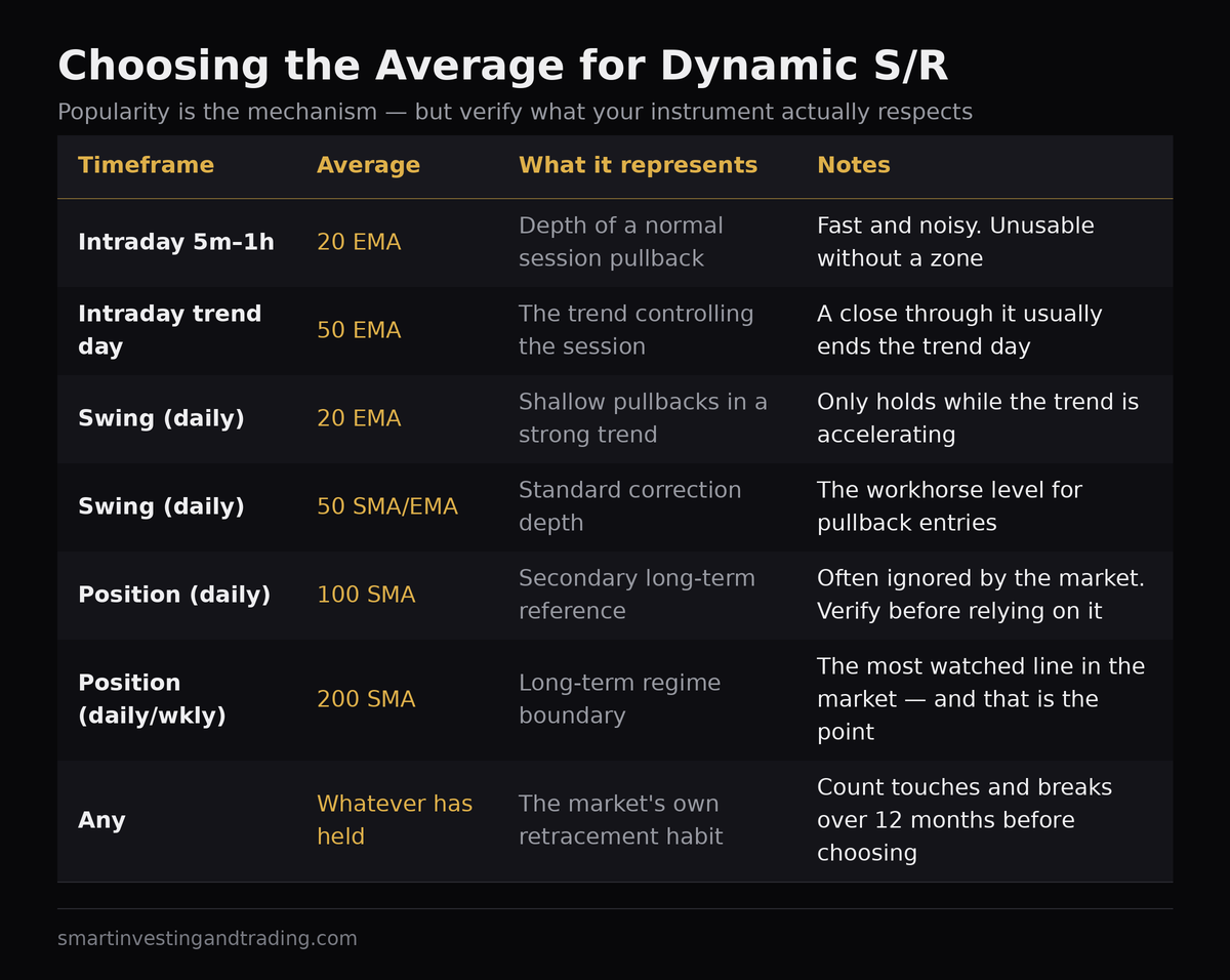
The 20, 50 and 200 are the defaults, and defaults exist for a reason — they are widely watched, which is the whole mechanism. But which of them your instrument respects is an empirical question with an answer, and it takes about five minutes to find it.
Pull up a year of daily data. Plot one average at a time. Count how often price came within a small distance of it and turned, versus how often it sliced clean through. Do it for the 20, the 50, the 100 and the 200. One of them will usually stand out, and it will often not be the one you expected. Currency pairs and index futures tend to respect different lines than individual growth stocks do, and the same instrument can switch after a volatility regime change.
Two practical notes on type. For dynamic support work, exponential averages are marginally more popular on shorter lookbacks — the 20 EMA and 50 EMA are the ones traders quote — while the long benchmark is almost always the 200-day simple average. That is not a mathematical judgement, it is a convention, and since the whole effect runs on convention you should follow it rather than fight it. The SMA vs EMA vs WMA comparison covers what actually differs between them under the hood, including the widely repeated claim about EMA lag that does not survive the algebra.
Stop drawing a line. Build a zone.
Every experienced trader eventually arrives at the same conclusion: the average is an area, not a price. StockCharts makes the same point in its own treatment of moving-average bounces — you wait for a reaction near the average and look for the price action to confirm it, rather than assuming the exact value will hold (ChartSchool). The same is true of ordinary horizontal levels, which is why ChartSchool recommends support zones there too (ChartSchool: Support and Resistance).
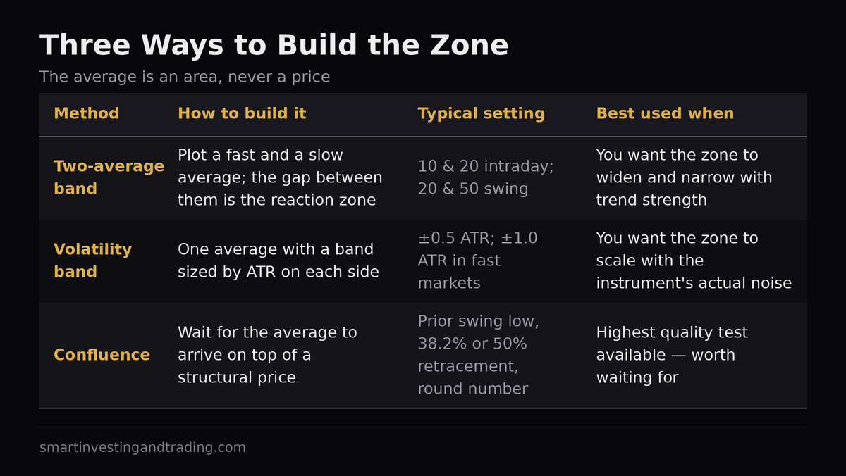
There are three sensible ways to build the zone, and they are not interchangeable.
The two-average zone
Plot a fast and a slow average — 10 and 20 for intraday, 20 and 50 for swing — and treat the band between them as the reaction area. This is the classic approach and it has one large virtue: the zone automatically widens when the trend accelerates and narrows when it stalls, because the gap between the two lines is itself a measure of trend strength. Its weakness is that the width has nothing to do with volatility, so in a quiet market the zone can be uselessly thin.
The volatility band
Take one average and put a band around it sized by ATR — typically half an ATR either side, or one full ATR in fast markets. This scales properly with the instrument’s actual noise, which is the honest way to answer “how close is close enough.” It is also the direct ancestor of moving average envelopes and of Bollinger Bands, both of which formalise the same idea.
Confluence
The strongest version is not a wider zone at all — it is the moment a moving average lands on top of something structural. A prior swing low, a Fibonacci retracement at 38.2% or 50%, a round number, a broken resistance level now acting as support. When the arithmetic line coincides with a price where real business was done, you have both mechanisms firing at once. These are the tests worth waiting for, and they are rarer than daily chart-scrolling would suggest.
Dynamic Support and Resistance – Confirmation: what you are actually waiting for
Touching the average is not a signal. It is an invitation to start paying attention. What turns it into a trade is evidence that the sellers who drove the pullback have run out, and there are only a few reliable forms that evidence takes.
A rejection bar at the zone. Price trades into the band and closes back out of it, leaving a tail. On a daily chart that tail is the day’s failed attempt to go lower — real information, not a pattern name.
A break of the pullback’s own structure. Drop to a lower timeframe and look at the pullback as its own little downtrend. It has lower highs. When one of those lower highs breaks while price is sitting in the zone, the correction has ended. This is the cleanest confirmation available and it gives you a defined invalidation point at the same time.
Momentum divergence into the test. If RSI or Stochastics is making a higher low while price makes a lower low into the average, the selling is decelerating exactly where you want it to. This is the one genuinely useful overlap between the two indicator families, and it is worth more than either signal alone.
What is not confirmation: the average being touched, a single green candle, or the fact that it bounced there last time.
Stops, and why “just below the average” is a bad answer
Here is where the Osler research becomes practical rather than academic. Stop-loss orders cluster just past the obvious level. That is the documented behaviour, and it means the region immediately beneath a widely watched average is the most liquidity-rich, most easily targeted patch of price on the chart. Putting your stop there puts it in a queue with everyone else’s.
Two adjustments follow.
First, place the stop at a volatility distance beyond the zone, not at its edge. A stop half an ATR below the lower boundary costs you a little on the losers you would have lost anyway and saves you on the ones that dip and recover. It is a small change with a measurable effect on a real track record.
Second, let the average do the work on the way out, not on the way in. The most robust way to use a moving average is as a trailing exit rather than an entry trigger — stay long while daily closes hold above the line, exit when they don’t. It is a slow, unglamorous rule with a long history of surviving out-of-sample testing, which is more than can be said for most bounce systems.
When the level breaks
Moving-average support fails constantly, and a method that treats every break as a trend change will get shredded. Three distinctions worth making:
A pierce is not a break. Intraday violations of a daily average happen on most tests. Judge by the close, on the timeframe you are trading, and preferably by two closes.
A break with a still-rising average is different from a break with a flattening one. The first is usually a deeper-than-normal correction inside an intact trend. The second is the trend actually ending. Slope again — it is the reading that does the most work in this entire subject.
Role reversal is weaker here than with horizontal levels. The textbook rule that broken support becomes resistance rests on trapped positions at a fixed price. A moving average has no fixed price, so when price breaks below and comes back to it, what you are really watching is whether the slope has rolled over. If the average is now falling and price fails at it, that is a genuine change of character. If the average is still rising and price recovers above it, the break was noise.
For the mechanical version of the same event — one average crossing another rather than price crossing one average — see moving average crossovers for trade entries. And for a way of watching many averages fan out or compress at once, moving average ribbons turn this same slope-and-separation reading into a visual.
Dynamic Support and Resistance – A short checklist before you take the trade
- Is the average sloping, clearly, on the timeframe I am trading? If not, stop here.
- Is price above a rising average (long) or below a falling one (short)? No counter-trend bounces off the wrong side.
- Is this the first, second or third test since the trend began — or the seventh?
- Does the zone coincide with anything structural: a prior low, a retracement, a round number?
- Do I have a reaction — a rejection bar, a broken pullback structure, a momentum divergence — or just a touch?
- Is my stop a volatility distance beyond the zone rather than sitting on the edge with everyone else’s?
- Is there enough room to a sensible target to make the risk worth taking?
Seven questions, and the trade has to pass all of them. That sounds strict until you count how many of your losing bounce trades failed at question one.
Dynamic Support and Resistance – FAQ
Which moving average works best as support?
There is no universal answer, but the 20 and 50 (exponential) and the 200 (simple) are the most widely watched, and being widely watched is the mechanism. Test which one your instrument has actually been respecting over the past year rather than assuming.
Does the 200-day moving average really act as support?
Often, on liquid indices and large-cap equities, because it is the single most watched line in the market and a great deal of institutional positioning references it. It is far less reliable on thin instruments where nobody is watching it.
Should I use the exact moving average value as my level?
No. Treat it as a zone — either the band between two averages or an ATR-sized band around one — and expect pierces. Precision on a line that moves every bar is false precision.
Why did the moving average stop working?
Usually because the trend ended and the market went sideways, where the average sits in the middle of the range instead of behind price. It can also be because the level has been tested too many times and the resting orders that made it work have been consumed.
Related reading
- What Are Moving Averages and How to Use Them to Trade Successfully — the pillar guide
- SMA vs EMA vs WMA: Which Moving Average Should You Actually Use?
- How to Use Moving Averages to Identify the Trend
- How to Use Moving Average Crossovers for Trade Entries
- Bollinger Bands, MACD and Fibonacci: The Complete Indicator Guide
- Oscillators: Stochastics, RSI, CCI and Williams %R


Add comment