

Bollinger Bands MACD and Fibonacci
A Forex Trader’s Guide
Bollinger Bands Macd and Fibonacci
There is a version of this article on almost every trading site on the internet. Most of them are copies of copies, and most of them contain the same handful of errors — wrong names, inverted formulas, a “Fibonacci” level that has nothing to do with Fibonacci. Traders read them, build systems on them, and then wonder why the signals don’t behave the way the article promised.
This is the corrected version. It covers the same three tools, but it explains where the numbers come from, what the indicators are actually measuring, and — more importantly — what they cannot tell you. If you are new to charting, start with the basics of reading price action and trend structure before you layer indicators on top of it.
Bollinger Bands MACD and Fibonacci
First, a word about what indicators are
Every indicator on your chart is a transformation of price. Not a supplement to price, not an independent opinion about price — a rearrangement of the same closing values you can already see. That has two consequences that most beginners never absorb.
The first is that indicators lag. A moving average of the last twenty closes cannot tell you anything about the twenty-first. It tells you where the market has been, arranged so your eye can see the shape more easily.
The second is that indicators built from moving averages are heavily correlated with each other. Adding MACD to a chart that already has Bollinger Bands does not give you two independent confirmations. It gives you one piece of information displayed twice. Traders who stack six indicators and wait for all six to agree are not being careful; they are being fooled by a false sense of consensus.
Used properly, indicators do one thing well: they impose a consistent, repeatable definition on something your eye judges inconsistently. That is worth a great deal. It is just not the same as prediction.
Bollinger Bands
What they are
Bollinger Bands are volatility bands plotted around a moving average. They were developed by John Bollinger in the early 1980s, at a time when trading envelopes used fixed percentage widths — a band 3% above and below a moving average, for instance. Bollinger’s insight was that volatility is not constant, so the bands should not be either. <a href=”https://www.bollingerbands.com/bollinger-bands” target=”_blank” rel=”noopener nofollow”>His own explanation of the tool is worth reading in full</a>.
The construction is simple:
- Middle band — a 20-period simple moving average of the close
- Upper band — middle band + (2 × standard deviation of the last 20 closes)
- Lower band — middle band − (2 × standard deviation of the last 20 closes)
A simple moving average is used, not an exponential one, because the standard deviation calculation is itself based on a simple average. Mixing an EMA centre with an SMA-based deviation gives you bands that are mathematically inconsistent with their own middle line.
The middle band is not “a line running somewhere near the middle,” as the recycled articles put it. It sits exactly in the centre by construction, and it is a meaningful line in its own right — often the first place a pullback in a healthy trend finds support.
Settings, and why the defaults are the defaults
Bollinger’s recommendation is 20 periods and 2 standard deviations. If you shorten the lookback, the deviation multiplier should come down slightly; if you lengthen it, it should go up. Roughly:
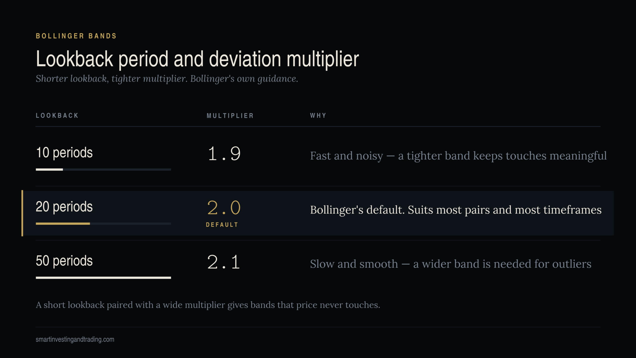
This matters because a short lookback with a wide multiplier produces bands that price almost never touches, which makes the tool useless. The old article that circulates online uses a 10-period/2SD example without mentioning any of this.
Bollinger’s advice is to adjust in small increments and to leave the settings alone once they suit the instrument. Constant re-optimisation is curve-fitting to noise.
What a band touch means — and what it doesn’t
Price at the upper band is not a sell signal. This is the single most expensive misreading in technical analysis.
The bands answer one question: is price high or low relative to recent trading? By definition, price is high at the upper band and low at the lower band. That is a statement about relative position, not about direction. In a strong trend, price will ride the upper band for weeks — a phenomenon known as walking the band — and every trader who shorted the first touch will have been stopped out long before the move ended.
The statistical framing is also worth getting right. Two standard deviations do not contain 95% of observations here. That figure comes from a normal distribution, and financial returns are not normally distributed — they have fat tails and volatility clusters. In practice something closer to 88–89% of closes fall inside 2SD bands, and the exceptions cluster together precisely when it matters most.
The two indicators that make bands useful
Bollinger built two derivative tools that most traders ignore, and both are more actionable than the bands themselves.
%b expresses where price sits within the bands as a single number. A reading of 1.0 means price is exactly at the upper band, 0.0 at the lower band, 0.5 at the middle. Above 1.0 means price has closed outside the upper band. Because it is a number rather than a picture, %b can be compared across instruments and used in rules and screens.
BandWidth measures the distance between the bands as a percentage of the middle band. It is the volatility reading, stripped of price position. When BandWidth falls to a multi-month low, the market is coiling — the setup Bollinger named the Squeeze.
A word of caution on the Squeeze in forex: it tells you a large move is likely, not which way it goes. The first break out of a squeeze is frequently a false one, particularly around scheduled data releases, when a burst of volatility resolves in the opposite direction within the hour. Size accordingly, and read our notes on position sizing and stop placement before trading breakouts of any kind.
Forex-specific notes
Currency pairs are mean-reverting far more often than equities, which makes band work attractive — but the 24-hour session means volatility is not evenly distributed. A 20-period band on hourly EUR/USD data is averaging across the Tokyo lunch lull and the London-New York overlap as though they were the same market. They are not. On intraday charts, either restrict your band work to a single session or expect the bands to be systematically too wide in quiet hours and too tight in busy ones.
MACD — Moving Average Convergence/Divergence
The formula, stated correctly
MACD was developed by Gerald Appel in the late 1970s. It has three components, and the order of subtraction matters:
- MACD line = 12-period EMA − 26-period EMA
- Signal line = 9-period EMA of the MACD line
- Histogram = MACD line − signal line
Two points where the widely-copied article gets it wrong. First, it states the calculation as the 26-period EMA minus the 12-period EMA, which inverts the whole indicator — every bullish reading becomes bearish. Second, it describes the signal line as “a 9-day moving average,” which reads as a 9-day average of price. It is not. It is an average of the MACD line itself, which is why it lags the MACD line rather than tracking price.
The histogram, incidentally, was not in Appel’s original work — Thomas Aspray added it later specifically to anticipate crossovers that were arriving too late on weekly charts.
If the mechanics of exponential averaging aren’t clear, our guide to moving averages and how they behave covers the weighting maths.
The three signals, in order of usefulness
Signal line crossover. MACD crosses above the signal line: bullish. Below: bearish. This is the most common signal and the least reliable in isolation, because in a range-bound market it fires constantly and every fire is a loss. Filter it by trend or ignore it.
Zero-line crossover. The MACD line crossing zero means the 12 EMA and 26 EMA have crossed — a genuine change in the medium-term balance. Slower, later, but far cleaner than the signal-line cross. Zero-line crossing combined with swing points is a documented strategy worth studying.
Divergence. The most valuable and the most abused.
Divergence, done properly
Bullish divergence is: price makes a lower low, MACD makes a higher low. That is the whole definition. Momentum is draining out of the decline even as price extends it.
Note what is not part of that definition: MACD turning positive. The recycled article says “if the MACD turns positive and makes higher lows while prices are still tanking,” which conflates two entirely separate events. During a genuine bullish divergence, the MACD line is normally still well below zero — that is precisely what makes it a divergence rather than a trend change. Crossing zero happens later, if the divergence works.
Bearish divergence is the mirror image: price makes a higher high, MACD makes a lower high.
Three rules that will save you money:
- Divergence is a warning, not an entry. It says the current move is tiring. It does not say when it ends. Markets diverge for months. Wait for confirmation — a break of structure, a signal-line cross, something.
- Count the swings. Divergence is only meaningful between comparable pivots. Comparing a MACD reading in the middle of a leg to one at a prior extreme is not divergence, it is pattern-matching on noise.
- In a strong trend, expect divergence and ignore it. A powerful trend will generate bearish divergence at every new high, because the initial thrust is always the most violent one. Divergence earns its keep at the ends of moves, not inside them.
On settings
Appel’s original work used different parameter sets for buy and sell signals — he was not treating 12/26/9 as universal. And those numbers are an artifact of the six-day trading week that existed when they were chosen: 12 was two weeks, 26 was a month, 9 was a week and a half. There is nothing sacred about them. What matters is that you pick a setting and stay with it long enough to develop a feel for how it behaves.
Fibonacci Retracements
Where the numbers actually come from
Two corrections to the standard telling, both of which appear in nearly every article on the subject.
The sequence was not discovered by Leonardo of Pisa, and not in the twelfth century. Leonardo — later nicknamed Fibonacci — published Liber Abaci in 1202, which is the thirteenth century. And the sequence appears in Indian mathematics several hundred years earlier, in the work of Pingala, Virahanka and Hemachandra, in connection with Sanskrit prosody. Leonardo introduced it to Western Europe. He did not invent it.
Retracement levels are not “a sequence of numbers.” They are ratios derived from the sequence, and knowing the derivation is what lets you tell a real level from a made-up one:
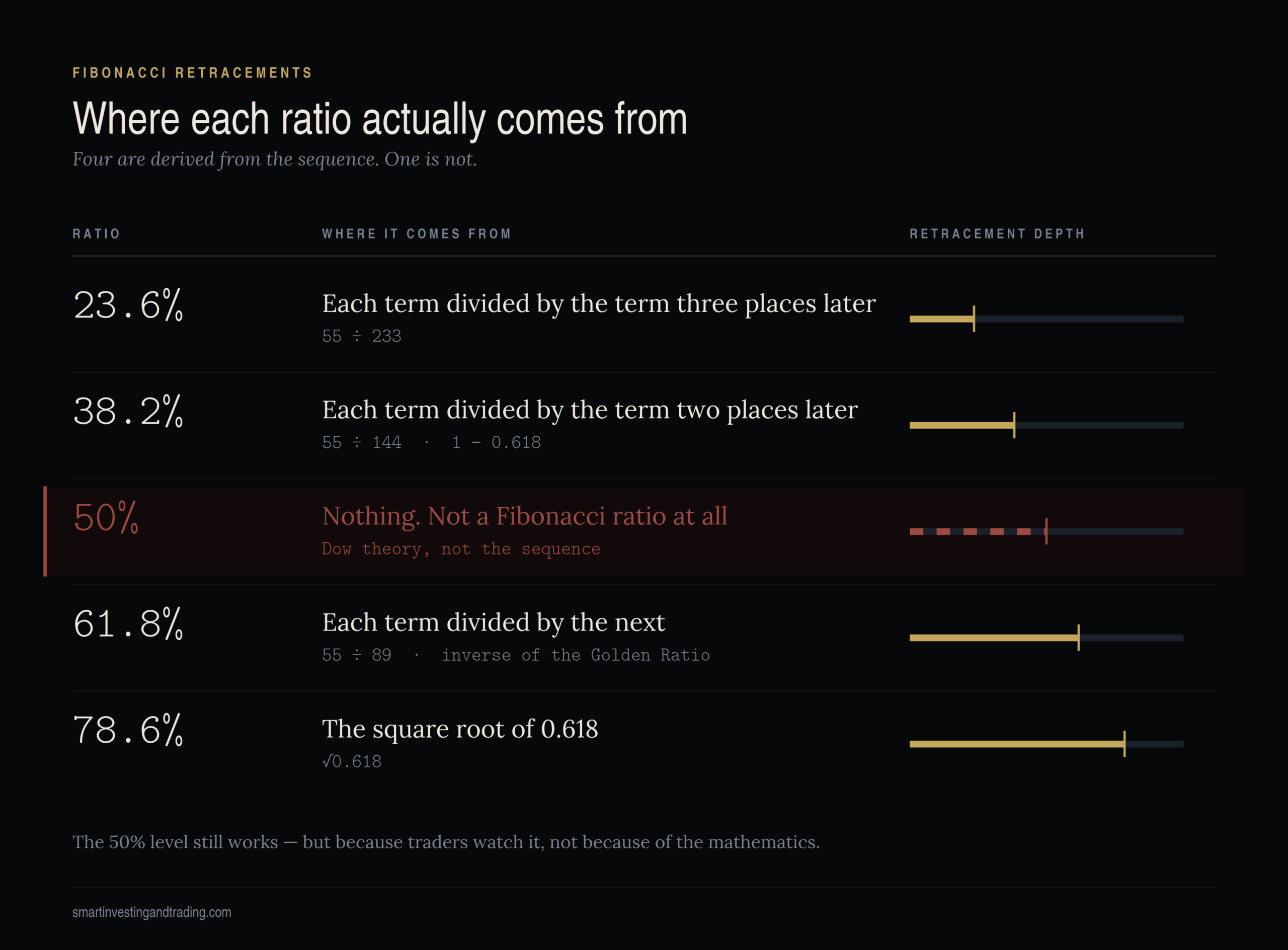
About that 50% level – is 50 a fibonacci retracement level
The 50% retracement comes from Dow theory, not from Fibonacci. It is in every Fibonacci tool on every platform, and traders use it constantly, and it does often act as support or resistance — but for an entirely different reason. Half a move is a psychologically obvious place to look. It works because everyone watches it, not because of any mathematical property.
This is not a pedantic point. If you understand that half of your “Fibonacci” levels are reflexive — they work because traders act on them — then you understand why they hold in liquid, heavily-charted markets like EUR/USD and fail in thin ones. You also understand why they fail during genuine repricing events, when the traders who would defend the level are the ones being liquidated.
The part nobody talks about: anchoring
Drawing the tool is trivial. Connect a swing high to a swing low and read the levels off. The difficulty is that you chose those two points, and a different pair of points produces a completely different set of levels.
This is where most Fibonacci analysis quietly fails. Given any chart, a determined trader can find a pair of pivots that puts a Fib level exactly where they already wanted to buy. That is not analysis. Discipline here means:
- Use the most recent significant swing, defined by a rule you wrote down before you opened the chart
- Anchor to actual highs and lows, including wicks, and be consistent about it — never switch to closing prices because it fits better
- Draw on the timeframe you are trading, then check one timeframe up for confluence
- If you cannot identify an obvious swing, there is no valid retracement to draw. Skip the trade
Confluence is the real signal
A retracement level on its own is a line on a chart. It becomes a level worth trading when other things agree with it: a prior support or resistance zone, a round number, the 200-period moving average, the Bollinger middle band, a Fib level from a higher timeframe landing in the same area.
The 61.8% level that coincides with a prior swing low and a psychological figure is a level. The 38.2% level sitting alone in open space is a line you drew.
Bollinger Bands MACD and Fibonacci
Putting the three together — carefully
There is a reason these three tools are so often taught as a set: they answer different questions.
- Fibonacci answers where — at what price might this pullback end
- Bollinger Bands answer how far — is price stretched relative to recent volatility
- MACD answers what is momentum doing — is the current move gaining or losing force
A workable sequence for a pullback entry looks like this:
- Establish the trend on a higher timeframe. Nothing below matters if you have the direction wrong.
- Draw the retracement on the leg you are trading. Identify the level with the most confluence.
- Wait for price to reach it. Do not anticipate.
- Check whether the Bollinger reading agrees — a pullback into the lower band and the middle band in an uptrend is a stronger setup than one that stalls halfway.
- Look for a momentum signal at the level — a divergence, a histogram turn, a signal-line cross.
- Only now consider an entry, with the invalidation point defined before you enter.
But keep the correlation warning in mind. Bollinger Bands and MACD are both moving-average constructions. When they agree, that is partly because they are measuring the same thing. Treat their agreement as one confirmation, not two, and get your genuinely independent confirmation from something structurally different — price structure, volume, the session and liquidity backdrop, or the fundamental calendar.
Bollinger Bands MACD and Fibonacci
The mistakes that cost the most money
- Treating a band touch as a reversal signal
- Entering on divergence instead of waiting for confirmation
- Redrawing Fibonacci anchors until the levels agree with an existing opinion
- Stacking correlated indicators and calling it confluence
- Re-optimising settings after every losing trade
- Trading indicator signals against the higher-timeframe trend
- Believing that any of this removes the need for a stop loss
Bollinger Bands MACD and Fibonacci
The closing advice — inverted
The article this one replaces ends by telling traders not to get too caught up in the mathematics. That advice is backwards, and it is why so many traders spend years cycling through indicators without ever improving.
You do not need to derive the exponential smoothing constant by hand. But you do need to know that Bollinger Bands assume a distribution that currency returns do not follow. You do need to know that MACD is a lagging oscillator built from two lagging averages, and therefore cannot lead price. You do need to know that half your Fibonacci levels work through reflexivity rather than mathematics.
Understanding why a tool behaves the way it does is precisely what stops you from trusting it in the conditions where it fails. Everything else — the settings, the parameters, the “ideal levels” — is secondary, and largely a matter of sitting with one configuration long enough to learn its personality.
If you want the settings you’ll actually keep, stop looking for the best ones and start keeping a record of how the ones you have behave. That record is worth more than any indicator on the chart.
Trading foreign exchange on margin carries a high level of risk and is not suitable for all investors. Nothing in this article constitutes investment advice.


Add comment