

Technical Analysis Basics: A Complete Introduction
Technical Analysis Basics
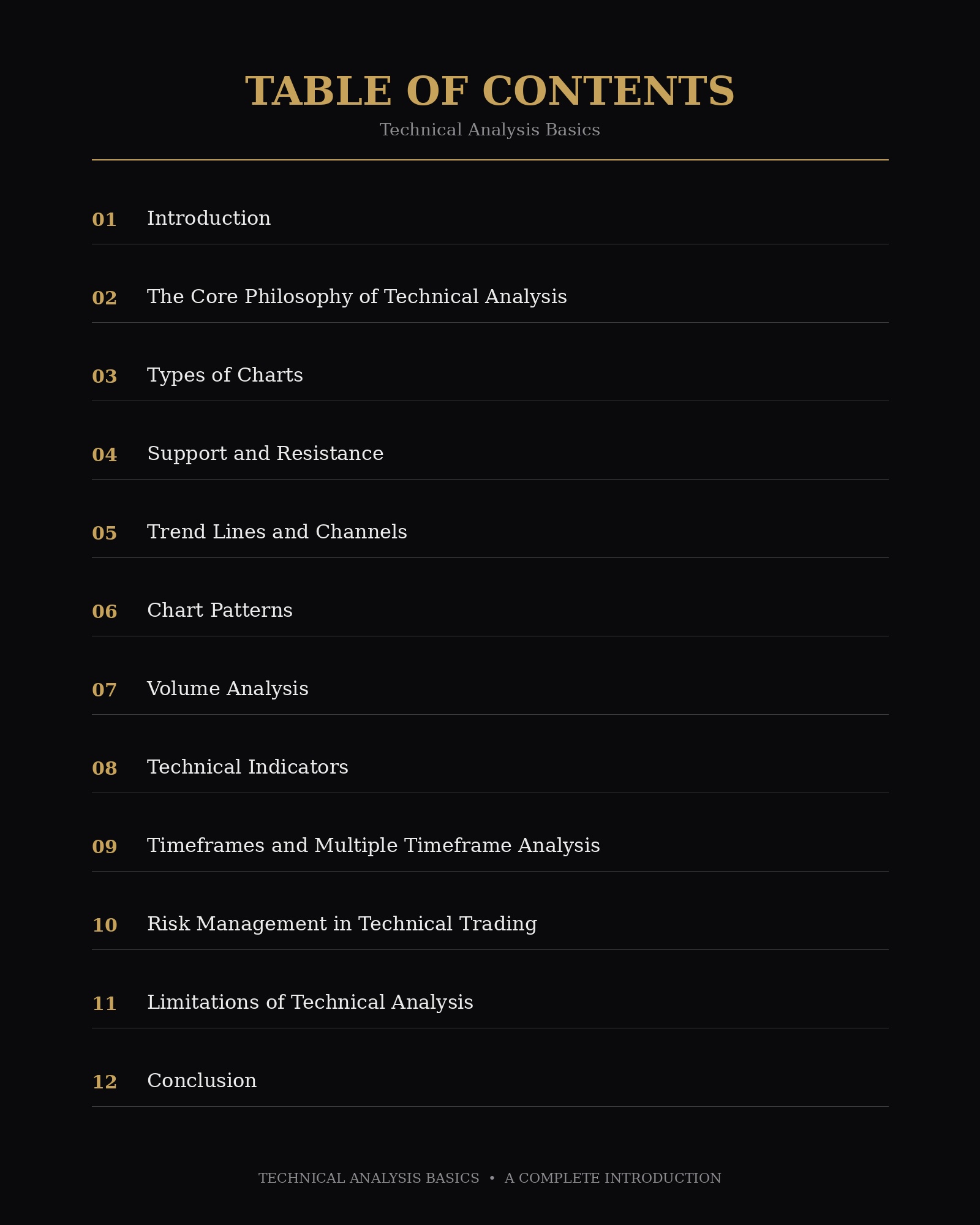
Introduction
Technical analysis is a method used by traders and investors to evaluate securities—stocks, currencies, commodities, and other tradable assets—by studying statistical trends gathered from trading activity, such as price movement and volume. Unlike fundamental analysis, which examines a company’s financial statements, management quality, and industry position to determine intrinsic value, technical analysis focuses purely on price action and market behavior. The underlying premise is that all known information is already reflected in the price, and that price movements tend to follow identifiable patterns that repeat over time due to the collective psychology of market participants.
This article walks through the core principles, tools, and techniques that form the foundation of technical analysis, giving you a solid base from which to explore more advanced strategies.
The Core Philosophy of Technical Analysis
Technical analysis rests on three foundational assumptions:
1. The market discounts everything. Technical analysts believe that a security’s price reflects all available information, including fundamentals, news, and market sentiment. Because of this, they argue that studying price is sufficient—there is no need to separately analyze economic factors, since those factors are already priced in.
2. Prices move in trends. Once a trend is established, it is more likely to continue in that direction than to reverse. This idea underpins the majority of technical strategies, which aim to identify a trend early and ride it until there is clear evidence it has ended.
3. History tends to repeat itself. Technical analysis is largely built around the study of market psychology. Chart patterns, which have been used for over a century, are based on the idea that traders often react to similar situations in similar ways, causing recognizable patterns to recur. This repetition is largely attributed to predictable human behavior, such as fear and greed.
Types of Charts
Charts are the primary tool of technical analysis. There are three main chart types traders rely on:
Line Charts connect closing prices over a chosen time period with a continuous line. They are the simplest form of chart and are useful for getting a broad view of price direction, but they omit a lot of information, such as intraday highs, lows, and opening prices.
Bar Charts display the open, high, low, and close (OHLC) for each time period. A vertical line represents the high-low range, with small horizontal ticks on the left (open) and right (close) sides. Bar charts provide more detail than line charts while remaining relatively easy to read.
Candlestick Charts are the most widely used chart type among modern traders. Originating in Japan in the 18th century for tracking rice prices, candlesticks display the same OHLC data as bar charts but in a more visually intuitive format. Each “candle” has a body representing the range between the open and close, and thin lines called “wicks” or “shadows” extending above and below to show the high and low. A filled or colored body typically indicates the close was lower than the open (a bearish candle), while an empty or differently colored body indicates the close was higher than the open (a bullish candle). Candlestick patterns—such as dojis, hammers, and engulfing patterns—are widely studied because they can signal potential reversals or continuations.
Support and Resistance
They are among the most fundamental concepts in technical analysis.
Support is a price level where a downtrend tends to pause or reverse due to a concentration of buying interest. As price falls toward support, demand is expected to increase, preventing further decline.
Resistance is the opposite: a price level where an uptrend tends to pause or reverse due to concentrated selling interest. As price rises toward resistance, supply is expected to increase, capping further gains.
These levels are not exact numbers but zones, since market behavior isn’t perfectly precise. Traders often draw horizontal lines at previous highs and lows to mark these levels. When a resistance level is broken, it often becomes a new support level, and vice versa—a phenomenon known as “role reversal.”
Trend Lines and Channels
A trend line is drawn by connecting a series of higher lows in an uptrend or lower highs in a downtrend. Trend lines help traders visualize the direction and strength of a trend, and a break of a well-established trend line is often interpreted as an early signal that the trend may be weakening or reversing.
When two parallel trend lines are drawn—one connecting highs and one connecting lows—they form a channel. Price often oscillates between these two boundaries, and traders may look to buy near the lower boundary and sell near the upper boundary in a well-defined channel.
Chart Patterns
Chart patterns are formations created by the price movements of a security on a chart, and they are typically categorized as either reversal patterns or continuation patterns.
Reversal Patterns signal that an existing trend is likely to change direction. Common examples include:
- Head and Shoulders: A pattern with three peaks, the middle one being the highest (the “head”), flanked by two lower peaks (the “shoulders”). This pattern typically signals a bullish-to-bearish reversal. An inverse version signals a bearish-to-bullish reversal.
- Double Top/Double Bottom: A double top forms when price reaches a high, pulls back, then rallies to a similar high before reversing lower. A double bottom is the mirror image, signaling a potential upward reversal.
Continuation Patterns suggest that a pause in the trend is temporary and the prior trend will likely resume. Common examples include:
- Flags and Pennants: Short-term consolidation patterns that occur after a sharp price move, usually resolving in the direction of the original trend.
- Triangles (ascending, descending, symmetrical): Formed as price consolidates into a narrowing range, often breaking out in the direction of the broader trend.
Volume Analysis
Volume represents the number of shares or contracts traded during a given period. It is a crucial companion to price analysis. It confirms the strength of a price move: a price increase accompanied by high volume is generally considered more reliable than one occurring on low volume, since it suggests broader participation and conviction behind the move. Conversely, a price move on weak volume may be more likely to reverse. Traders often watch for volume spikes at breakout points to confirm that a chart pattern is playing out as expected.
Technical Indicators
Beyond visual chart patterns, technical analysts use mathematical calculations based on price and volume to generate indicators. These generally fall into a few broad categories:
Trend Indicators
Moving Averages smooth out price data to help identify the direction of a trend. A simple moving average (SMA) calculates the average price over a specified number of periods. An exponential moving average (EMA) gives more weight to recent prices, making it more responsive to new information. Traders often watch for “crossovers”. For instance, when a shorter-term moving average crosses above a longer-term one (a “golden cross”), it’s often seen as a bullish signal, while the opposite (“death cross”) is seen as bearish.
Moving Average Convergence Divergence (MACD) is a trend-following momentum indicator that shows the relationship between two moving averages of a security’s price. It consists of the MACD line, a signal line, and a histogram, and is used to spot changes in momentum, direction, and strength.
Momentum Indicators
Relative Strength Index (RSI) measures the speed and magnitude of recent price changes on a scale of 0 to 100. It is helping identify overbought or oversold conditions. Readings above 70 are traditionally considered overbought. Readings below 30 are considered oversold, though these thresholds can vary by asset and market conditions.
Stochastic Oscillator compares a security’s closing price to its price range over a specific period, also generating readings between 0 and 100 to highlight potential overbought or oversold conditions.
Volatility Indicators
Bollinger Bands consist of a moving average with two bands plotted above and below it, based on standard deviation. When the bands narrow, it often signals low volatility and the possibility of a significant price move ahead. When they widen, it reflects higher volatility.
Average True Range (ATR) measures market volatility by calculating the average range between high and low prices over a set period. It doesn’t indicate direction but is useful for setting stop-loss levels appropriate to current volatility.
Volume Indicators
On-Balance Volume (OBV) adds volume on up days and subtracts it on down days to create a running total, helping traders spot whether volume is confirming or diverging from price trends.
Timeframes and Multiple Timeframe Analysis
Technical analysis can be applied across virtually any timeframe. From one-minute charts used by day traders to weekly or monthly charts used by long-term investors. Many traders use multiple timeframe analysis. It is examining a higher timeframe to establish the overall trend and a lower timeframe to fine-tune entry and exit points. For example, a swing trader might use a daily chart to determine the broader trend direction and a 4-hour chart to time entries within that trend.
Risk Management in Technical Trading
No discussion of technical analysis is complete without addressing risk management, since even well-researched trades can fail. Common risk management practices include:
- Stop-loss orders, which automatically close a position if the price moves against the trader beyond a predetermined level, limiting potential losses.
- Position sizing, which involves determining how much capital to allocate to a single trade based on account size and risk tolerance. It is often expressed as a fixed percentage of total capital risked per trade.
- Risk-reward ratios, which compare the potential loss on a trade to the potential gain. Helping traders evaluate whether a setup is worth taking even if it isn’t guaranteed to succeed.
Limitations of Technical Analysis
While widely used, technical analysis has notable limitations. Critics point out that patterns can be subjective—two analysts may interpret the same chart differently. There’s also the risk of self-fulfilling prophecy. Where a pattern “works” simply because enough traders act on it, rather than because it reflects any underlying market truth. Additionally, technical analysis does not account for sudden, unpredictable events. Such as geopolitical shocks or earnings surprises. That can cause prices to gap sharply regardless of prior chart structure. For this reason, many practitioners combine technical analysis with fundamental analysis. Also broader risk management practices rather than relying on it in isolation.
Conclusion
Technical analysis offers a structured framework for interpreting price action and market psychology through charts, patterns, and indicators. Its core tools are support and resistance, trend lines, chart patterns, volume, and a range of mathematical indicators. They give traders a common language for discussing and anticipating market behavior. Like any methodology, it isn’t foolproof. Its effectiveness depends heavily on how it’s applied. Combined with sound risk management, and adapted to the specific asset and timeframe being traded. For beginners, the best approach is to start with a handful of core concepts. Those are chart types, support and resistance, and one or two indicators—and build complexity gradually as experience grows.
This article is for educational purposes only and does not constitute financial advice. Trading and investing involve risk, and past patterns do not guarantee future results.


